Tuesday, 22 January 2013

florence and the machine breath of life video analysis


http://www.youtube.com/watch?v=ROtBbOcdFxo  

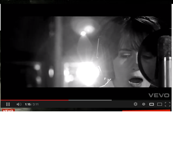
The video shoots from The singer and her producing the video itself and it also flicks to shots from the film 'snow white and the huntsman' that it was an over track for too, which makes the video more exciting.


When the shots are of her producing the video they are done in black an white to show the serious side of the production and the main creation of the song, giving the black and white effect and the close up angles of the camera it shows the seriousness of the genre being indie rock.


Also when the video ends it fades out with a bright white light to show that the video and song has come to an end, and throughout the video the shots flash from shot to shot and by the way that i editor has done this doesn't just show the band and singer to be centering their music around them but by adding shots from the film in shows what the song is really about.

Wednesday, 9 January 2013

one night only band website.

One night only 
http://onenightonlyonline.com/
Their genre is alternative rock and indie rock.
their website is under construction as of now but their temporary one is mainly black and white with bold and basic text. It also they have a video on their home screen to show their music and video and they have a selling point promotion for itunes.   

Tuesday, 8 January 2013

website set ups.

basic website set up


set up idea for our site.


The white stripes band website research.


The white stripes. 

On intro page there is one single image placed in the middle of the screen with a intense scene pictured and it is all in black , white and with some red to highlight it.
Their genres would be : indie rock, punk blues, blues rock, alternative rock and garage rock. 
This band website is really different to the other indie web sites i have researched and viewed, there is a mainly red block base color with black and only hints of white. the page tabs are all different symbols that you have to hover over to see what they are and then click to go to the page.
the iconic name of white stripes is represented with the pictures of the penguins with white stripes on their bodies being the background of the website and also the black and white trim border is also blending well with the name of the band. although the symbols on the pages bar at the top seem complicated the website lay out itself is quite basic but the tabs at the top of the site don't really involve the audience all that much. 

the arctic monkeys website research.

The arctic monkeys 
www.arcticmonkeys.com 

main page tabs;
-home
-news
- gigs --> dates&venues
-photos
-videos
-releases
-fans forum
-sign up
-members
-store
their genre would be : indie rock, post punk revival, garage rock and psychedelic rock. 

  • the front page has a video of the band playing live and important news articles about the band also some gig information and some social networking links. 
  • the colors used are all black and white in block color, so there is no grey or any other colors.  
  • the typography is in sans serif, which shows the modern theme to the band gelling with the classic theme of black and white only. 
  • title is bold and slightly slanted to show the fun side to the band and also shows their originality in the font as it is different to any other font on other bands sites. 
  • pages such as sign up and fans forum are there to get the fans involved which shows that the band also care a lot about their fans which is what the audience want to see and be able to get involved with. 

Florence and the Machine web research.

Florence and the Machine
www.florenceandthemachine.net


  • Grey. Also some other bland colors such as washed out purple, yellow and green. 
  • Image of main vocal person in the group.
  • Links to their pages on social networking sites. 
  •  Videos. 
  • Important information about the bands plans and agenda. 
  • Title of the band in their specific font of the band. 
  • Genre would be : indie rock, indie pop, baroque pop, neo soul and art rock. 

main page tabs on the site such as;
-home
-news
-blog
-about
-media
-video
-gallery
-live
-sign up
-store
-members
  • plain earthly colors in gallery images for her indie rock clothing style and look. 
  • the sign up page gets the audience to feel involved and receive updates about the band. 
  • the videos, gallery, about and news page give new and old audience an insight in to what the band are all about and what kind of music they create and what kind of things they do and what they are like as people and even about the background of the artists. 
  • members and store pages get the audience of the site involved by allowing them to become a part of the site and also to enable them to buy things that have been designed by the band. 


band basics.

Band name : News for Lisa.
Genre : Indie Rock
Similar bands : Florence and the machine, One night only, Razorlight, Frank Turner, Oasis, Reverend and the makers. Enemy, white stripes, Biffy Clyro, Bat for lashes, Arctic monkeys.
CD titles : Downfall of Lisa
Tour name : When the world ends.
Magazines : Nme, Q, Mix mag
Image :  Triangles as an iconic symbol for indie stereotype, hats and scarfs, baggy tops/shirts, skinny jeans and high wasted shorts, braces, old vintage blazers, piercings.
Promotion video venue : potential locations- Highlands park, London (iconic backgrounds), local town, Beaches (Frinton & Walton as such).
Web & Mag style : block colors of black and white. possibly some sepia tone pictures, all clothing in images that could be color must be plain, boring, and basic.

Audience

Our general fan base would tend to be between their late teen years and mid twenties. they would usually wear similar styles of clothing and colors of clothing as we do as a band. They would wear mainly loose fitting tops mostly plain or with some iconic symbols on them in large print. Also a blazer of jacket even sometimes a baggy shirt over the top of their tee shirt with skinny fit jeans or even denim high wasted shorts. Often they would wear a scarf, tie or bow tie to complete their outfit and sometimes they wear thick black rimmed glasses that are large in size and not necessarily needed to aid their site but as a fashion statement. Also some more mainstream indie lookers tend to wear a beanie hat or trilby hat to also complete their look.
 for example clothing on www.beyondretro.com .